Table of contents
Having Interactive Infographics in articles is important for bloggers. They make posts more interesting and easier to understand. HubSpot found that articles with infographics get 72% more views than articles without them. This is because infographics break down complex ideas into smaller pieces that are easier to understand.
Interactive infographics can also help to increase engagement. When readers can interact with the information, they are more likely to stay on the page longer and share the content with their friends.
The goal of any infographic should be to present information in a way that is both informative and engaging. By using interactive infographics, bloggers can make their posts more interesting, informative, and engaging, which can lead to more views, shares, and followers.
Summary Video
Below is a short video summarizing this article.
What are Interactive Infographics?
Firstly, an infographic is a visual representation of information or data. It is typically made up of charts, graphs, images, and text that are used to communicate a message or tell a story. Infographics are often used to explain complex topics in a way that is easy to understand. The saying “a picture is worth a thousand words” is often used to describe the power of infographics to communicate complex information in a simple and easily digestible way.
1. Definition of Interactive Infographics
Interactive infographics are a type of infographic that enables the audience to actively engage with the content by clicking, hovering, scrolling, or even inputting data. This interactivity can enhance understanding, exploration, and customization of the information presented.
For example, you could use an interactive infographic to teach about the different types of clouds. The infographic might have a picture of a cloud with different parts labelled. The user could click on each part to learn more about it, like what it’s called, what it looks like, and how it’s formed.
According to a recent
study
, interactive content is 2x more effective at driving engagement than static content. This is likely because interactive content is more engaging and interesting, which can help keep users engaged for longer periods.
2. Interactive Infographics vs. Static Infographics
Interactive infographics are a relatively new type of infographic that has become increasingly popular in recent years. As the name suggests, interactive infographics are designed to be interactive, allowing users to interact with the content in various ways. On the other hand, static infographics are traditional infographics that are not interactive.
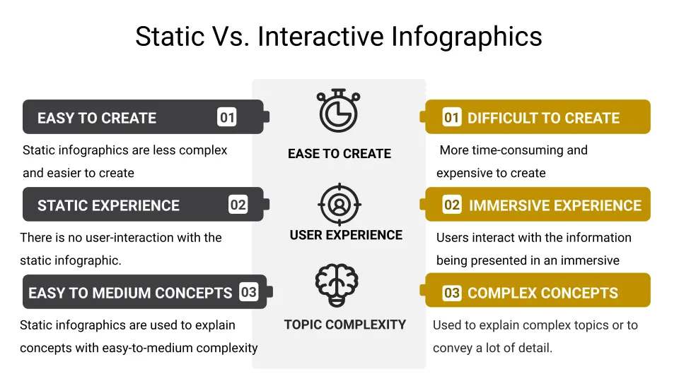
Static infographics are less complex and easier to create than interactive infographics. They are a great way to present information in a visually appealing way and can be used to convey complex data in a simple and easy-to-understand manner. They are also easy to share on social media platforms and can be printed for use in presentations and reports.
On the other hand, interactive infographics offer a more engaging and immersive experience for users. They allow users to interact with the information being presented and explore data in more detail. Interactive infographics can also be more memorable and impactful, as users are more likely to remember information that they have actively engaged with. However, interactive infographics can be more time-consuming and expensive to create than static infographics.
Overall, the choice between interactive and static infographics depends on the goals of the project and the needs of the target audience. If the goal is to present information in a simple and easy-to-understand manner, a static infographic may be the best choice. If the goal is to engage users and provide a more immersive experience, an interactive infographic may be more appropriate
Types of Infographics
There are many different types of infographics, each one designed to present information differently. Here are some common types of infographics:
1. Statistical Infographics

Statistical Infographics, also known as data visualization or information graphics, are a way to show numerical data in a way that is easy to understand. They often use charts, graphs, and diagrams to show trends, comparisons, and patterns in the data.
For example, a statistical infographic could use a series of bar charts to compare the sales performance of different products in a specific time period.
2. Timeline Infographics
Timeline infographics are visual representations of chronological events or processes. They allow you to present information in a linear and sequential format, making it easy for viewers to understand the progression of events over time.
Below is an example timeline infographic showing FIFA world cup winners since 1998.

Here are a few examples to illustrate different types of timeline infographics:
-
Historical Events: A timeline infographic showcasing major historical events, such as the timeline of World War II or the history of space exploration.
-
Project Milestones: A timeline infographic highlighting important milestones or key stages of a project, from inception to completion.
-
Personal or Professional Journey: A timeline infographic documenting personal or professional achievements, career progression, or personal growth milestones.
-
Company History: A timeline infographic displaying the evolution and major milestones of a company or organization.
-
Biographical Timeline: A timeline infographic detailing the life events and achievements of a person, such as the life of a famous scientist or historical figure.
Timeline infographics are a great way to learn about anything that happened over time. They are easy to understand, and they can help you see the big picture.
3. Process Infographics

Process infographics, also known as flowcharts, are pictures that show how something works. They use boxes and lines to show the steps in a process in order. Process infographics are helpful for understanding complicated tasks or projects.
Process infographics can for example, be used to show how to make a cake or build a birdhouse. They show each step in a clear and logical order, so it is easy to follow.
4. Comparison Infographics
Comparison infographics are a helpful way to show the similarities and differences between things. They use pictures and words to make information easy to understand. Comparison infographics can be used to compare products, services, concepts, or anything else that has two or more parts.
They are a great way to see the big picture quickly. You can see how things are alike and different at a glance. This makes it easy to make decisions or learn new things.
 Comparison infographics can be used for many different purposes. They can be used to:
- Compare different products or services
- Show the pros and cons of something
- Explain a concept
- Make a decision
- Explore different ideas
No matter what you use them for, comparison infographics are a great way to communicate information clearly and effectively.
5. Geographic Infographics (Maps)
Geographic infographics use maps to show information about places. They can be used to show statistics about different regions, population data, travel trends, or anything else that has to do with geography.
Here is an example geographic infographic depicting USA population density by state:
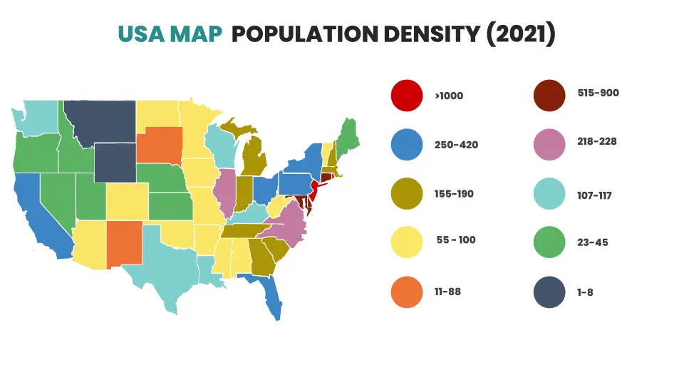
Other examples of geographic infographics include: a geographic infographic showing the average temperature in different countries or the population density of different cities. These kinds of infographics can also be used to show historical information, such as the spread of diseases or the routes of trade.
6. Hierarchical Infographics

Hierarchical infographics focus on showing how things are organized. They are helpful for showing how things are connected in different systems, like a family tree or a company chart. They show information in a way that makes it easy to understand complex structures.
Hierarchical infographics can also show how different things are grouped together. For example, they can show how different animals are classified into groups like mammals, birds, and reptiles. This helps people understand the relationships between different things.
Here are some specific examples of hierarchical infographics:
- A family tree is a hierarchical infographic that shows how people are related to each other.
- A company chart is a hierarchical infographic that shows how people are ranked in a company.
- A biology textbook might have a hierarchical infographic that shows how different animals are classified.
7. Interactive Infographics
Interactive infographics are more engaging than regular infographics because they let readers interact with the content. You can click on icons to see more information or animations, which helps you understand the topic better. This makes learning more fun and memorable.
Below is an interactive infographic we have created which shows the three largest football/soccer stadiums in the world. Click the button to get started.
World Map: Top 3 Stadiums in the World
Loading...
8. Informational infographics
Informational infographics are designed to present complex information or processes in a simple and easy-to-understand manner.
Examples of informational infographics include:
-
How-to infographics: These infographics are used to provide step-by-step instructions on how to complete a task or process, such as how to make a recipe or how to assemble a piece of furniture.
-
Explanation infographics: These infographics are used to explain a complex concept or process in a simple and easy-to-understand manner, such as how the human body works or how a computer processor works.
-
List infographics: These infographics are used to present information in a list format, such as the top 10 tips for a particular topic or the benefits of a particular product or service.
Overall, informational infographics can be a powerful tool for presenting complex information in a way that is easy to understand and engaging for audiences
9. Venn Diagram Infographics
Venn diagrams use circles to show how different sets of things are alike and different. They are a good way to show the relationships between things.
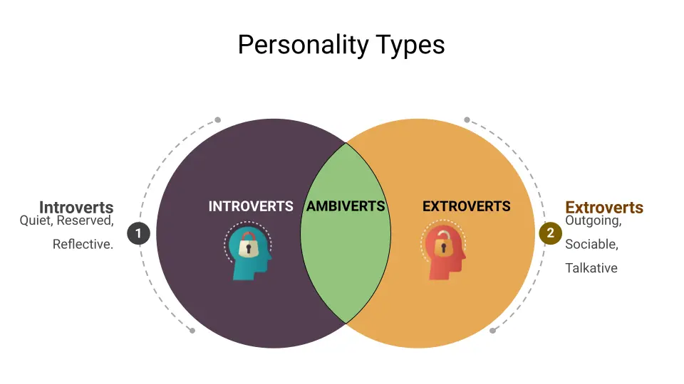 Here are some examples of how Venn diagrams can be used:
- A blogger could use a Venn diagram to show the differences between two different types of products.
- A marketer could use a Venn diagram to show the overlap between different groups of people who might be interested in their product.
- An educator could use a Venn diagram to show the similarities and differences between different concepts in a lesson.
- A business could use a Venn diagram to show the different ways that their customers use their product.
Benefits of Interactive Infographics for Bloggers

A
study
found that interactive content gets 2 times more people to take action than regular content. It also found that
interactive content is 93% better
at teaching people than regular content.
In addition, interactive infographics offer several benefits for bloggers, including:
-
Increased engagement: Interactive infographics can help to increase engagement with blog content by providing an immersive and interactive experience that encourages readers to spend more time on a blog post.
-
Improved user experience: Interactive infographics can provide a better user experience by allowing readers to explore information in a way that is more engaging and memorable than static content.
-
Increased social sharing: Interactive infographics are more likely to be shared on social media platforms, as they are visually appealing and provide a unique and engaging way to present information.
-
Improved SEO: Interactive infographics can help to improve search engine optimization (SEO) by attracting backlinks and social shares, which can help to increase the visibility of a blog post in search engine results pages.
-
Enhanced brand image: Interactive infographics can help to enhance a blogger’s brand image by providing a visually appealing and engaging way to present information, which can help to establish the blogger as an authority in their niche.
Overall, interactive infographics can be a valuable tool for bloggers looking to engage readers and present information in a more effective and memorable way
Creating Interactive Infographics
Creating an interactive infographic can be a great way to engage your audience and make complex information more accessible and easy to understand. Here are some steps to follow when creating an interactive infographic:
1. Choose a topic:
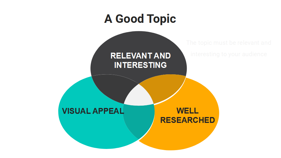
The first step in creating an interactive infographic is to choose a topic that is relevant and interesting to your audience. This could be anything from a current event to a scientific concept or a product or service.
Research your topic to ensure that there is enough data and information available to create an engaging and informative infographic. Look for data sources, articles, and other resources that can help you to develop your content.
Also, consider the visual appeal of your topic. Choose a topic that lends itself to visual representation, such as data-driven topics or topics with interesting imagery. By choosing a visually appealing topic, you can create an infographic that is engaging and memorable.
2. Gather your data:
Once you have chosen a topic, you will need to gather the data or information that you want to include in your infographic. This could involve conducting surveys, analyzing existing data sets, or performing experiments. Make sure that your data is accurate and relevant to your topic.
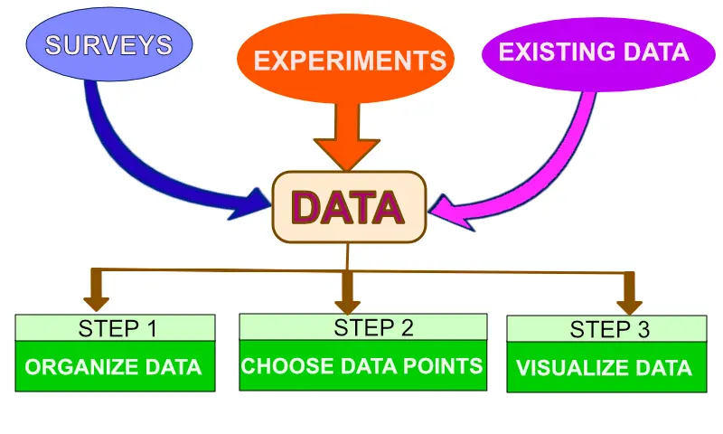
Organize your data: Once you have collected your data, it’s important to organize it in a way that makes sense. This could involve creating spreadsheets or databases to store your data, or using data visualization tools to help you analyze and interpret your data.
Choose your data points: Not all of your data will be relevant to your infographic. Choose the data points that are most important and relevant to your topic, and discard any data that is not necessary.
Visualize your data: Once you have chosen your data points, it’s time to visualize your data. This could involve creating charts, graphs, or other visual elements to help communicate your data in a clear and engaging way.
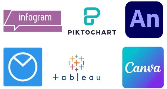
3. Choose a tool:
There are a variety of tools available for creating interactive infographics, such as
Adobe Animate
,
Tableau
, and template based programs like
Infogram
,
Canva
or
Venngage
. When choosing a tool, there are several factors to consider, including your skillset and the learning curve of the tool.
Here are some things to keep in mind when choosing a tool:
-
Skillset: The tool that you choose should be compatible with your current skillset. If you have experience with writing javascript code, Adobe Animate is an excellent tool to use for interactivity. Data visualization experience is very good for tableau although you can still create some interactive infographics with limited data visualization or programming experience, with an hour of free online tutorials. However, even with no programming experience whatsoever, you can create good-enough interactive infographics with template-based tools like Venngage and Infogram.
-
Learning curve: The learning curve of the tool is also an important consideration. Some tools, such as Adobe Animate, offer advanced features but can be complex and time-consuming to learn. Template-based tools, such as Infogram, offer a more user-friendly interface but may have limitations in terms of customization and advanced features.
-
Features: The features offered by the tool should also be considered. Some tools may offer a wide range of interactive elements out of the box, such as animations, quizzes, and hover-over effects, while others may be more limited in terms of out-of-the-box functionality.
-
Budget: Finally, the cost of the tool should also be considered. Some tools, such as Infogram, can be expensive, although most have a free plan, while others, such as Canva, offer low-cost options.
4. Add interactive elements:
 Adding interactivity to your infographic involves incorporating interactive elements such as clickable buttons, animations, hover-over effects, and quizzes. However, in order to incorporate these elements, one must have access to a publishing option in their tool of choice where the published output is an HTML file, embed code in HTML, or a link. It’s important to note that some tools do not offer this option on their free plan.
Once you have published your interactive infographic, you have the option to embed it on your blog or share it on social media. If possible, use the HTML file rather than an embed code, as this allows for more customization of the behavior and control of things like page-speed load. However, these kinds of customizations require programming knowledge in many cases. But, you can still have beautiful interactive infographics with the embed code.
When adding interactivity to your infographic, it’s important to keep your audience in mind. The interactive elements should be designed to engage users and help them to explore the data or information in more detail.
5. Test and refine:
Once you have created your interactive infographic and incorporated it in your blog, it’s important to test it and refine it based on user feedback. Make sure that the interactive elements are functioning properly and that the overall design is engaging and easy to use on most device types including mobile devices.
Overall, creating an interactive infographic requires careful planning, design, and execution, but can be a powerful tool for engaging audiences and making complex information more accessible and easy to understand
How Bloggers use Interactive Infographics for Marketing

Interactive infographics are a powerful tool for bloggers to create engaging and informative content to help them stand out in a crowded digital landscape. In this section, we will explore how bloggers can use interactive infographics for marketing purposes.
(i) SEO
Interactive infographics can attract high-quality backlinks from other websites and social media platforms, as they tend to be more shareable and linkable than static content. This can improve a blogger’s search engine rankings and drive more organic traffic to their website. According to a recent study , interactive content generates 2x more conversions than passive content.
(ii) Content Creation
Interactive infographics can also be used as a way to create new content or re-purpose old content for a blogger’s website or social media channels. With the ability to customize colours, fonts, and interactive elements, bloggers can create visually stunning and easy-to-understand infographics that can be downloaded and shared on social media.
(iii) Increased Engagement
Interactive infographics are a great way to engage readers and keep them interested in a blog’s content. By including interactive elements, such as quizzes, polls, and animations, bloggers can create a more immersive and engaging experience for their readers. According to a recent survey , 91% of consumers prefer interactive and visual content over traditional, static content.
(iv) Brand Awareness
Interactive infographics can be customized to include branding elements such as logos, colors, and fonts. By incorporating their brand identity into the design, bloggers can increase brand awareness and recognition among their audience.
Examples of Interactive Infographics
Interactive infographics leverage technology to engage users actively, providing a more immersive and enjoyable experience. Here are some examples of interactive infographics:
1. Interactive Data Charts
With interactive charts, you can hover over the chart to get more details about a data point. Here is an example chart about the richest countries by GDP per capita. More details are observed on hovering over the bars in the barchart.
The Richest Countries in the World
Loading...
Some interactive data infographics can let you change the numbers and how they are shown. You can change the time period, choose which data to show, and see the information in different ways, like bar graphs, line graphs, or pie charts.
2. Interactive Maps
Interactive maps allow users to explore geographic information in a dynamic and engaging way. These maps often include features such as zooming, panning, and filtering, which enable users to interact with the data and gain deeper insights into the information being presented.
One example of an interactive map is the New York Times’ COVID-19 Tracker , which allows users to view the number of cases and deaths in various parts of the world. The map, as of March 2023, is updated in real-time and includes a range of filters and search functions that enable users to explore the data in greater detail.
3. Quiz-Based Infographics
These infographics combine the engaging format of a quiz with the informative content of an infographic. This type of infographic often includes multiple-choice questions, which allow users to test their knowledge of the subject matter and receive immediate feedback on their answers.
One example of a quiz-based infographic is the New York Times’ “How Y’all, Youse and You Guys Talk” quiz , which allows users to test their knowledge of regional dialects in the United States. The quiz includes a series of multiple-choice questions, each with a corresponding map that shows the prevalence of different dialectical features in various parts of the country.
4. Decision-Making Infographics
Decision-making infographics allow users to make informed decisions by presenting information in a clear and organized way. These types of infographics often include a series of steps or options that users can follow in order to arrive at a desired outcome. Here is an example of a decision-making infographic which we have built for this article.
5. Scroll-Triggered Animations
When people scroll down an infographic, scroll-triggered animations show them new information one at a time. This is like telling a story, because it reveals the information at the right pace to keep people interested. This also makes the infographic more engaging, because people have to keep scrolling to see the whole thing.
6. Drag-and-Drop Infographics
This type of interactive diagram lets people move things around on the screen to show how things are connected or to reveal hidden information. It is often used to explain concepts or how things work or even to show how one thing causes another.
Here is one such infographic that we have built to show the benefits of intractive content. Incorrect answers snap back to their original position.
Interactive Benefits Infographic
Loading...
7. 360-Degree Infographics
360-degree infographics let people look at a picture or scene from all sides. These infographics are usually designed to be viewed in a 360-degree environment, such as a virtual reality headset or a panoramic view on a computer screen.
One example of a 360-degree infographic is the
“360-Degree View of the Brain”
which allows users to rotate a model of the human brain in a 360-degree environment. Some other models include interactive features that allow users to zoom in and out on different regions of the brain, as well as information about the functions of each area.
8. Interactive Storytelling:

In this type of infographic, users read a story that has different paths depending on what they choose. The user’s choices will lead them to different parts of the story, which gives them a unique experience.
One example of an interactive storytelling infographic is “The Refugee Project” by Hyperakt and Ekene Ijeoma, which tells the stories of refugees from around the world. The infographic includes a series of interactive elements, such as maps, timelines, and some personal stories, that allow users to explore the experiences of refugees and learn about their journeys.
9. Interactive Data Filters
These infographics let people choose what information they want to see. For example, you can choose to see data about people of a certain age, from a certain place, or who bought a certain product. This lets you find the information you need and learn new things.
One example of an interactive data filter is the “Filter Data from Your Views” feature in Tableau, which allows users to quickly include or exclude data in a view by using interactive filters. These filters are automatically added to the view when a user drags a field to the Filters shelf, and can be customized to meet the user’s specific needs.
Interactive infographics are powerful tools for content creators, marketers, and educators. They encourage users to participate, help them understand the information better, and leave a lasting impression. When designed and created well, interactive infographics can greatly improve the user experience.
Conclusion
Interactive infographics are a great way for bloggers to engage their audience and drive traffic to their websites. They are more fun and interactive than regular infographics, and they can help people learn more about a topic.
There are many different types of interactive infographics, like interactive data charts and timeline infographics. These infographics let people interact with the content and learn more about the topic.
Bloggers can use interactive infographics to create engaging marketing campaigns that drive traffic to their websites and increase their social media following. By presenting data in a visually appealing and interactive way, bloggers can increase engagement and improve their SEO.
In conclusion, interactive infographics are a powerful tool that bloggers can use to create engaging content that drives traffic to their websites and increases their social media following. They are easy to create with content creation platforms like Visme and Venngage.