Table of contents
Teaching can be tough, especially when students’ attention span is low or they are distracted by potentially a million things, including and especially, their phones. That’s why it’s important to use visuals to capture students’ attention and keep them engaged. And the stats don’t lie: studies have found that students remember up to 80% of what they see and do, compared to only 10% of what they hear (National Institute for Standards and Technology, 2002).
In this article, we will talk about the benefits of using interactive infographics in the classroom or online tutorials; we give examples of how educators can use these tools to create engaging learning experiences. We will also give a comparison of the best infographic tools to use. By the end of this article, educators will have a better understanding of how to use interactive infographics to improve their teaching and engage their visual learners.
What exactly are interactive infographics?
Firstly, an infographic is a visual representation of information or data. It is typically made up of charts, graphs, images, and text that are used to communicate a message or tell a story. Infographics are often used to explain complex topics in a way that is easy to understand.
Interactive infographics are designed to be interactive, allowing users to explore and interact with the content in a variety of ways. By adding things like quizzes and surveys, educators can create engaging and dynamic experiences that help students better understand complex topics and develop critical thinking skills.
In education, interactive infographics can be used to teach a wide variety of subjects and topics. For example, a science teacher might use an interactive infographic to help students visualize the different components of a complex system, while a history teacher might use an interactive infographic to help students explore the causes and effects of a particular historical event.
Why interactive infographics are great for educators

Interactive infographics have become increasingly popular in the field of education due to their ability to engage students, present complex information in a visually appealing manner, and enhance the overall learning experience. Here are several reasons why interactive infographics are a great tool for educators:
-
Visual Engagement: Interactive infographics combine visual elements such as graphs, charts, images, and animations to present information in an engaging and visually stimulating way. This visual appeal captures the attention of students and helps them better understand and remember the content being presented. Studies have shown that visuals can help students learn up to 400% better.
-
Interactive Learning Unlike traditional static infographics, interactive infographics allow students to actively engage with the information. They can explore different elements, interact with data points, and navigate through sections, providing a hands-on learning experience. This interactivity promotes critical thinking, problem-solving, and deeper comprehension of the subject matter.
-
Data Visualization: Interactive infographics are highly effective in presenting complex data sets and statistics. By using interactive features such as hover effects, tooltips, and interactive charts, educators can help students grasp complex concepts more easily. Students can interact with the data, analyze patterns, and gain a deeper understanding of the information being conveyed.
-
Personalized Learning: Interactive infographics allow educators to create customized learning experiences tailored to individual student needs. With interactive elements, educators can provide additional information, links to external resources, or interactive quizzes within the infographic. This personalization enables students to explore topics at their own pace and delve deeper into areas of interest.
-
Multimedia Integration: Interactive infographics can seamlessly integrate various multimedia elements such as videos, audio clips, and interactive maps. This multimedia integration enhances the learning experience by providing additional context, real-life examples, or audio explanations, making the content more engaging and accessible for diverse learning styles.
-
Easy Accessibility: Interactive infographics can be easily shared and accessed online, making them accessible to students anytime, anywhere. Educators can embed interactive infographics in learning management systems, websites, or presentations, allowing students to revisit the content and reinforce their understanding outside the classroom.
In summary, interactive infographics offer educators a powerful tool to engage students, present information in an interactive and visually appealing manner, promote critical thinking, and enhance the overall learning experience. By leveraging the benefits of interactive infographics, educators can create dynamic, personalized, and engaging learning environments that foster deeper understanding and knowledge retention among students.
Types of Interactive Infographics for Educators
Interactive infographics offer educators a wide range of possibilities to present information in engaging and interactive ways. Here are some common types of interactive infographics that can be utilized in educational settings:
Exploratory Infographics
These infographics allow students to explore a topic or concept by interacting with various elements. They may include clickable buttons, interactive maps, or tabs that reveal additional information. Exploratory infographics encourage students to delve deeper into the subject matter, enabling a more immersive and self-directed learning experience.
Data Visualization Infographics
These infographics focus on presenting complex data sets in a visually appealing and interactive format.
The Richest Countries in the World
Loading...
Data Visualization Infographics may include interactive charts, graphs, or diagrams that allow students to manipulate variables, toggle between different data points, or view data trends over time. Data visualization infographics help students develop data analysis skills and gain a deeper understanding of statistical information.
Interactive Tutorials
Interactive tutorials provide step-by-step guidance on a particular topic or process. They often incorporate interactive elements, such as clickable hotspots, tooltips, or interactive quizzes, to reinforce learning and assess comprehension. Interactive tutorials are particularly useful for introducing new concepts, guiding students through procedures, or providing hands-on practice.
Story-based Infographics
Story-based infographics present information in a narrative format, engaging students through storytelling techniques. They may include interactive animations, timelines, or interactive characters that guide students through a sequence of events or historical developments. Story-based infographics help create a captivating learning experience and facilitate students’ understanding of chronological or cause-and-effect relationships.
Interactive Assessments
These infographics serve as assessment tools, incorporating interactive elements to evaluate students’ knowledge and understanding. They may include interactive quizzes, drag-and-drop exercises, or interactive diagrams that require students to apply their learning. Interactive assessments provide immediate feedback, allowing educators to gauge students’ progress and identify areas for improvement.
Gamified Infographics
Gamified infographics incorporate game-like elements to enhance engagement and motivation. They may feature interactive challenges, rewards, or progress tracking. Gamified infographics can be used to introduce gamification principles in the classroom, making learning more enjoyable and encouraging healthy competition among students.
These are just a few examples of the types of interactive infographics that can be used in educational settings. The choice of infographic type depends on the learning objectives, subject matter, and the desired level of interactivity. By leveraging the diverse range of interactive infographic formats, educators can create engaging and dynamic learning experiences that cater to different learning styles and promote active participation among students.
How to Create Interactive Infographics for Educators

With the right tools, anyone can make a cool infographic that will keep their students interested. Here are some steps to make an interactive infographic for your students.
Step 1: Choose learning Objectives and Gather Necessary Assets
To make an interactive infographic, you first need to pick a learning objective. For example, if you’re teaching about ecosystems, your learning objective might be to help students understand the interrelationships between different organisms within an ecosystem.
You then need to gather relavant assets such as text, images, videos, or data related to your objective. For instance, using our ecosystem example, you might gather information about different species, their habitats, and their roles within the ecosystem. Data can be obtained from many places, like surveys, research studies, textbooks, other tutorials, and various databases. After you have your data, you can start thinking about how you want to show it in your infographic.
Step 2: Select the Right Type of Infographic
There are many kinds of infographics to choose from, like
exploratory Infographics
or
gamified Infographics
. Each kind of infographic is best for showing different kinds of information. Below is a table showing possible use-cases for each infographic type.
| Infographic Type | Possible Use Cases |
|---|---|
| Exploratory Infographics | Complex topics, systems, or processes that require exploration and in-depth understanding. Ideal for subjects like ecosystems, historical events, or scientific phenomena. |
| Data Visualization Infographics | Presenting data-driven information and statistics in a visually appealing and understandable format. Suitable for showcasing trends, comparisons, or patterns in fields such as economics, demographics, or scientific research. |
| Interactive Tutorials | Step-by-step guides or instructional infographics that provide interactive learning experiences. Great for teaching specific skills, software usage, or guiding students through a process. Useful in subjects like programming, graphic design, or laboratory experiments. |
| Story-based Infographics | Narrating a sequence of events or presenting information in a storytelling format. Effective for historical timelines, biographies, or conveying a cause-and-effect relationship. Engages students through a cohesive narrative and structure. |
| Interactive Assessments | Assessing student knowledge or understanding through interactive quizzes, puzzles, or challenges embedded within the infographic. Useful for formative assessments, self-assessment, or reinforcing concepts through interactive exercises. |
| Gamified Infographics | Adding game-like elements and mechanics to infographics to enhance engagement and motivation. Ideal for subjects that can be gamified, such as language learning, mathematics, or geography. Provides a fun and interactive learning experience. |
Step 3: Add Interactive Elements
One of the best things about making an interactive infographic is that you can add things that make students interact with the information. Choose interactive elements that align with your learning objectives. Examples include clickable buttons, interactive maps, or draggable elements.
For our ecosystem infographic, you could use a clickable diagram that reveals information about each organism when clicked or you could incorporate interactive quizzes to assess students’ understanding.
To further enhance your infographic, you could embed video, audio or add animated graphics.
Step 4: Choose a Design Tool
Select a design tool that suits your needs, skill level and budget. Canva , Piktochart , or Infogram are popular options for educators. These tools help even those with limited design experience to create visually appealing infographics quickly with the use of premade templates, icons, and design elements.
Design gurus may choose to use a mix of various tools, including the use of a tool like Adobe Illustrator to create some of their own graphics and then introducing interactivity with the use of any of the other tools.
If your programming skills are good, you could use a tool like Adobe Animate which will help you create complex interactivity for your infographic, including drag-and-drop activities as well as advanced custom animations.
Here are more details about the various tools that are good for educators.
Step 5: Test, Launch and Refine
Test the interactive elements to ensure they function correctly. Check for any technical issues, broken links, or inconsistencies. Share the infographic with a couple of colleagues or students to gather feedback and make necessary refinements.
Once finalized, publish the interactive infographic in a format that is easily accessible to educators and students. You can export it as a web page, PDF, or embed it within a learning management system or educational website. Share clear instructions on how to interact with the infographic.
Continuously evaluate the effectiveness of the interactive infographic in achieving your learning objectives. Gather feedback from user to assess its impact on understanding and engagement. Make updates or revisions as necessary to ensure its relevance and effectiveness.
What are the tools for interactive infographics?
There are several tools available to create interactive infographics, each offering unique features and user-friendly interfaces. Here are some popular ones to improve your visual learning offerings and attain a new level of student engagement:
1. Canva
Canva
is a popular online design tool that can be used to create interactive infographics for educators. It offers a range of design templates and tools that can be used to create engaging and interactive visuals that help to communicate complex information.
One of the key benefits of Canva is its ease of use. Even those with little design experience can use Canva to create professional-looking infographics. The platform offers a wide range of templates that can be customized to suit the user’s needs, and it also includes a drag-and-drop interface that makes it easy to add and adjust design elements.
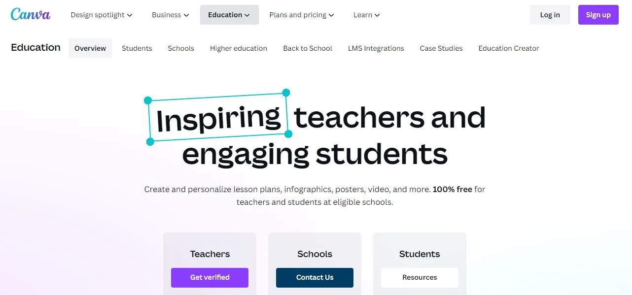
In addition to its design capabilities, Canva also offers a range of options for sharing and distributing infographics. Users can easily export their designs in a variety of formats, including PDF, PNG, and JPG, and they can also share their designs on social media platforms, websites, and learning management systems (LMS).
Canva for Education is a special version of Canva that is designed specifically for educators. It includes features such as collaborative design tools, access to millions of images and graphics, and the ability to share designs with students and colleagues. Canva for Education also integrates with popular LMS platforms such as Google Classroom, Canvas, and Schoology, making it easy to share designs and assignments with students.
2. Piktochart
Piktochart is a popular online tool that can be used to create interactive infographics for educators. It is designed for simplicity, making it easy for users with little design experience to create engaging and informative visuals.
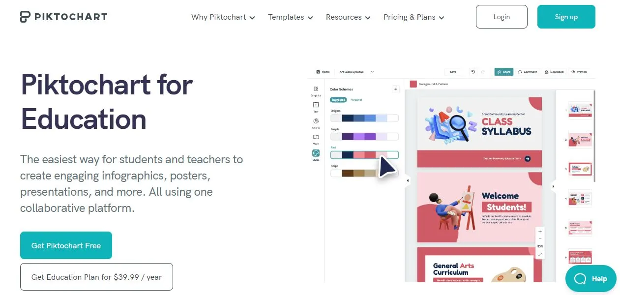
One of the key features of Piktochart is its chart and map makers. These features allow users to build beautiful data visualizations that help to communicate complex information in a clear and concise way. The chart maker includes a range of chart types, such as bar charts, line charts, and pie charts, while the map maker allows users to create interactive maps that can be customized with data and information.
Piktochart also offers a range of templates that can be customized to suit the user’s needs. These templates are designed to be easy to use and can be customized with a range of design elements, such as images, icons, and text.
In addition to its design capabilities, Piktochart also offers an affordable education plan for educators and their students. This plan includes access to all of Piktochart’s features and templates, as well as a range of educational resources and support.
3. Adobe Illustrator and Adobe Indesign
Adobe InDesign and Adobe Illustrator are powerful design tools that can be used together to create interactive infographics for educators. InDesign is a layout and publishing tool that is ideal for creating multi-page documents, while Illustrator is a vector graphics editor that is ideal for creating detailed illustrations and graphics.
By using these tools together, educators can create interactive infographics that include a range of design elements, such as text, images, charts, and illustrations. They can also use InDesign’s interactive features, such as buttons, hyperlinks, and animations, to create engaging and interactive content that helps to communicate complex information in a clear and concise way.
One of the benefits of using Adobe InDesign and Illustrator is that they are part of the Adobe Creative Cloud suite of tools, which includes a range of other design tools such as Photoshop, Premiere Pro, and After Effects. Educators and students can take advantage of the education discount offered by Adobe Creative Cloud, which makes it more affordable to access these tools and use them for educational purposes.
Another benefit of using Adobe InDesign and Illustrator is the Publish Online option, which allows users to export their designs as interactive online documents that can be shared and viewed online. This feature is particularly useful for educators who want to share their infographics with a wider audience, such as students, colleagues, or the general public.
4. Infogram
Infogram is an online tool for creating interactive infographics that is widely used by educators. One of the key features of Infogram is its focus on interactivity, which allows educators to create engaging and informative visuals that help to communicate complex information in a clear and concise way.
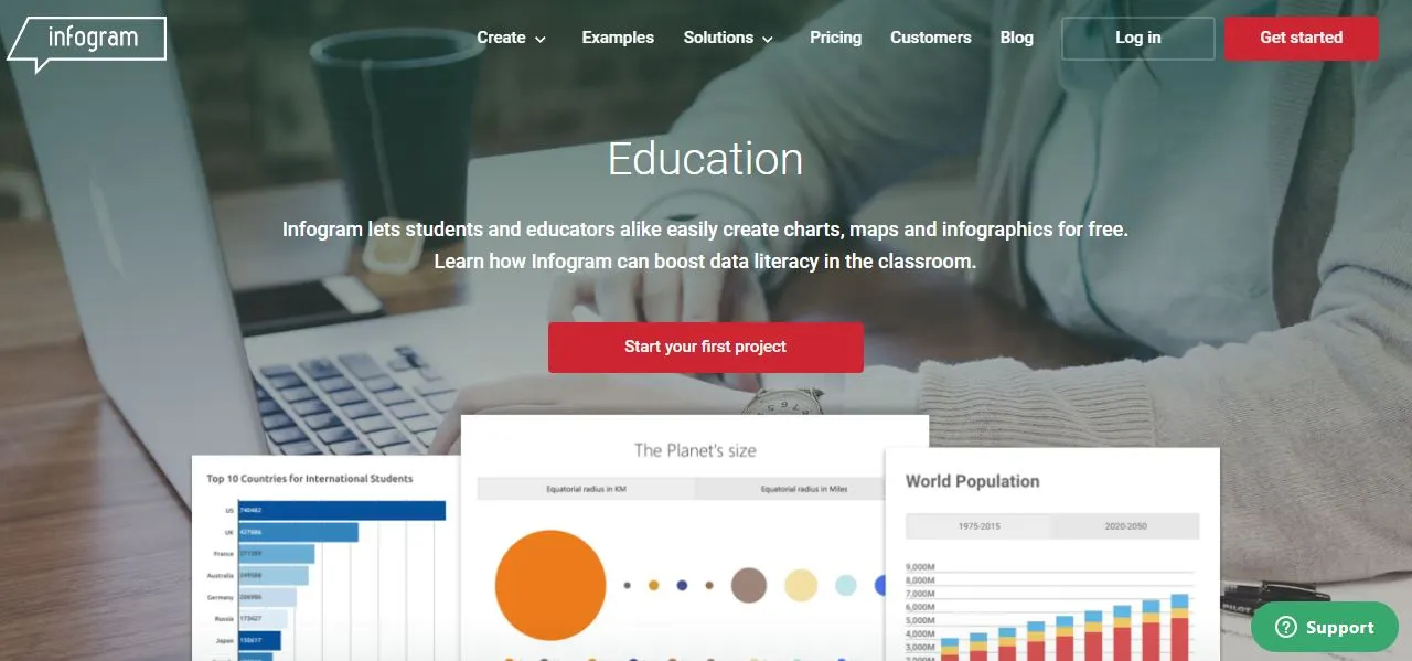
Infogram offers a range of design tools, including maps and charts, that can be customized to suit the user’s needs. These tools are designed to be easy to use, even for users with little design experience, and they allow educators to create professional-looking infographics that are visually appealing and informative.
In addition to its design capabilities, Infogram also offers a range of publishing options that are optimized for mobile devices. This makes it easy for educators to share their infographics with students and colleagues, even when they are on the go.
Another benefit of Infogram is its special pricing for educational organizations. This makes it more affordable for educators to access the platform and use it to create engaging and informative visuals that help to enhance the learning experience for their students.
5. Genially
Genially is a powerful platform that allows educators to create interactive infographics with ease. One of the standout features of Genially is its “Free forever for core features” plan, which provides users with a wide range of interaction and animation settings without requiring any payment information. This is particularly useful for educators who may be working with limited budgets.
Genially also caters specifically to schools and universities, providing a range of features that make it an ideal tool for educators. Its focus on interactivity, from virtual escape rooms to drag-and-drop puzzles and game-based content, makes it an excellent platform for engaging students and creating memorable learning experiences.
One of the most significant advantages of using Genially is that, with just a few clicks, you can create eye-catching animations in your infographic that will capture the attention of your students and make your content more engaging. When you are done with your masterpiece, you can easily share it, using a link, on your website, article, or Learning Management Systsem.
In addition to its ease of use, Genially also offers a range of features that make it an ideal platform for educators. For example, it provides a wide range of templates that can be customized to suit your needs, as well as a variety of tools for creating interactive content.
Overall, Genially is a powerful tool for educators looking to create interactive infographics and engage their students with multimedia content. With its free core features, focus on interactivity, and ease of use, it’s a platform that is well-suited for the needs of educators at all levels.
6. ThingLink
While not a traditional infographic tool, ThingLink is a powerful platform that allows educators to create interactive images and videos by adding clickable hotspots with additional information or links. This makes it an ideal tool for creating engaging and dynamic content that can capture the attention of students.

ThingLink offers a wide range of features that make it an ideal platform for educators. For example, it provides a variety of customization options that allow users to create interactive content that is tailored to their specific needs. It also provides a range of tools for creating interactive content, such as the ability to add text, images, and videos to your hotspots.
Another advantage of using ThingLink is its pricing. While it does offer a free plan, its paid plans provide access to a range of powerful features, such as the ability to embed your interactive content on your website or LMS, and the ability to create custom icons and branding for your content. This makes it an affordable option for educators who are looking for a powerful tool for creating interactive infographics.
All in all, ThingLink is a powerful platform that offers a range of features that are well-suited for educators. Its ability to create interactive content with clickable hotspots makes it an ideal tool for creating engaging and dynamic infographics. With its powerful features and affordable pricing, it’s a platform that is well worth considering for educators who are looking for a powerful tool for creating interactive content.
7. Looker Studio
Google's Looker Studio (formerly Google Data Studio) is a powerful and free platform that allows educators to create data-driven interactive infographics with ease. One of the standout features of Looker Studio is its ability to connect to all your usual data sources, which makes it easy to create interactive infographics that are based on your existing data.
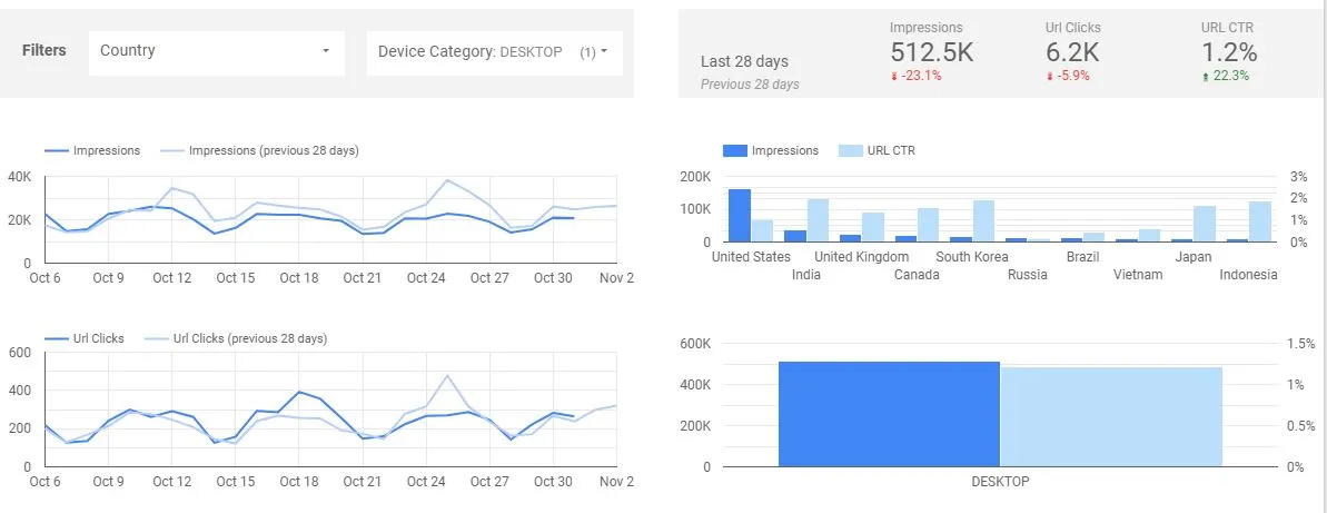
In addition to its ability to connect to data sources, Looker Studio also provides a range of sharing options that make it easy to share your interactive infographics with your students. For example, you can share your infographics via email, or embed them directly into your website or LMS.
An advantage of using Looker Studio is that your students never need to access the data source directly. This is because Looker Studio provides a secure and controlled environment for accessing and manipulating data, which means that your students can interact with the data without needing to have direct access to it.
For advanced users, Looker Studio also provides the ability to create custom functions to manipulate their data. This makes it an ideal platform for educators who are looking for a powerful tool for creating custom data-driven infographics.
In a nutshell, Looker Studio is a powerful and free platform that offers a range of features that are well-suited for educators. Its ability to connect to all your usual data sources, its sharing options, and its support for custom functions make it an ideal tool for creating data-driven interactive infographics.
Comparing the tools
Before choosing a tool, consider the complexity of your interactive infographic project, your design and analytical skills, as well as your budget.
Some tools are easier to use and learn than others, a number of them providing ready-made starter templates to help you save time and to provide some inspiration.
Based on how much interactivity you want to include in your infographic, you may want to consider the customization options available with each tool. Finally, you will need to get a tool at a price that is affordable and yet provides the value you need.
Below, we have done a comparison of the various tools to help you decide on a tool that suits your needs.
1. Complexity
One of the main things to things to consider when choosing a tool for your infographic creation, is the complexity of tool. Some tools are easier to learn than others. In the chart below, we assign complexity scores to each tool. The lower the score, the easier the tool is to use or learn.
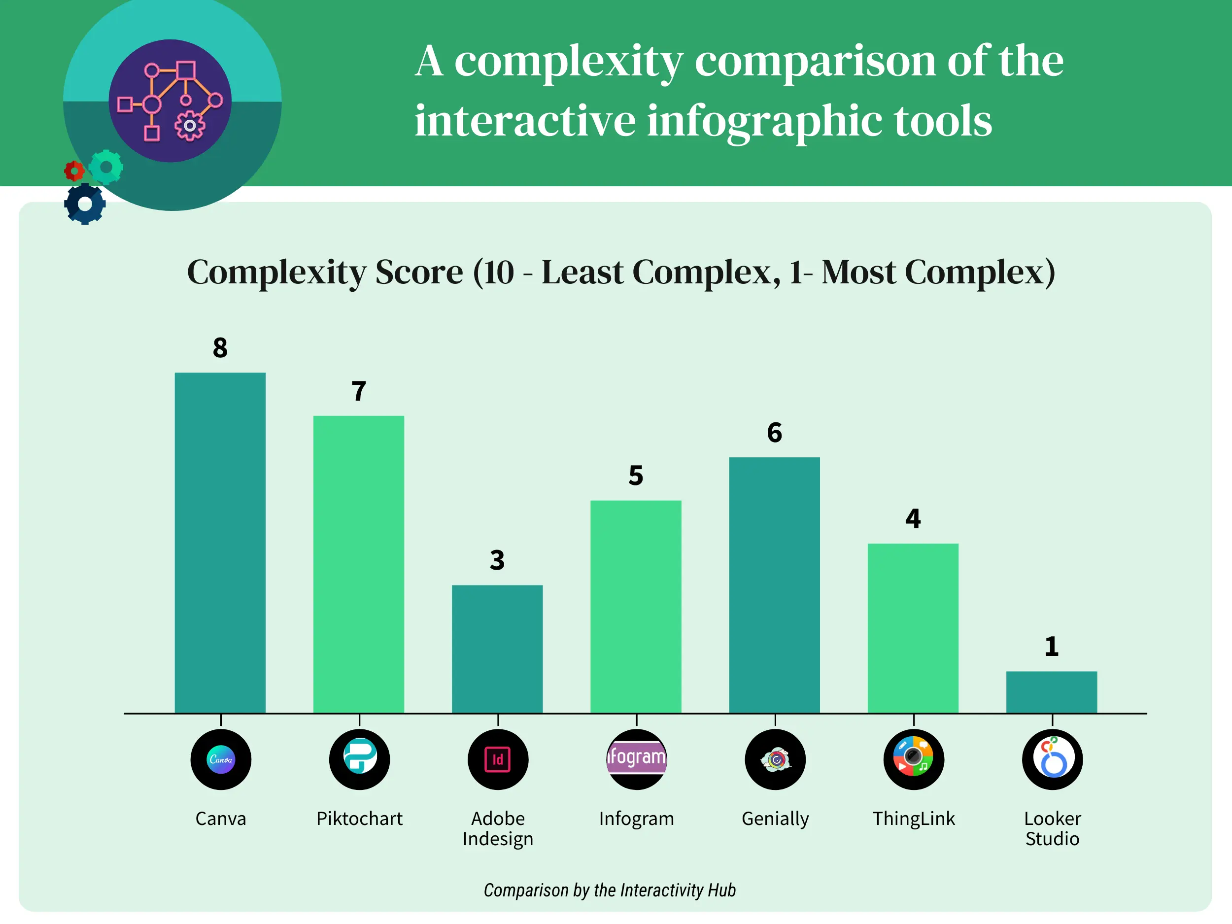
- Canva and Piktochart are very intuitive to use for both educators and students with their drag-and-drop interfaces and template-driven designs.
- Genially is also fairly simple although it has more options for interactivity than Canva or Piktochart.
- Infogram is centered around data visualization so it has a learning curve for layouts, but is still relatively easy to use.
- ThingLink allows for multimedia annotation but requires more steps than Canva, Piktochart, Genially or even Infogram.
- InDesign is a very powerful desktop option but is quite complex for simple interactive infographic creation compared to web-based alternatives.
- Looker Studio is the most advanced option and would require training for educators to utilize its full capabilities, earning it the highest complexity score.
2. Customization Options
Customization plays a crucial role in tailoring the visual and interactive elements of your infographics to match your specific needs and brand identity. The ability to customize colors, fonts, layouts, and interactive features enables you to create visually stunning and engaging infographics that effectively convey your message.
In our chart below, we compare the various tools based on customization options available for each tool. The lowest score indicates a tool with the least number of customization options and the highest score is for the tool that empowers the user with the best customization options.
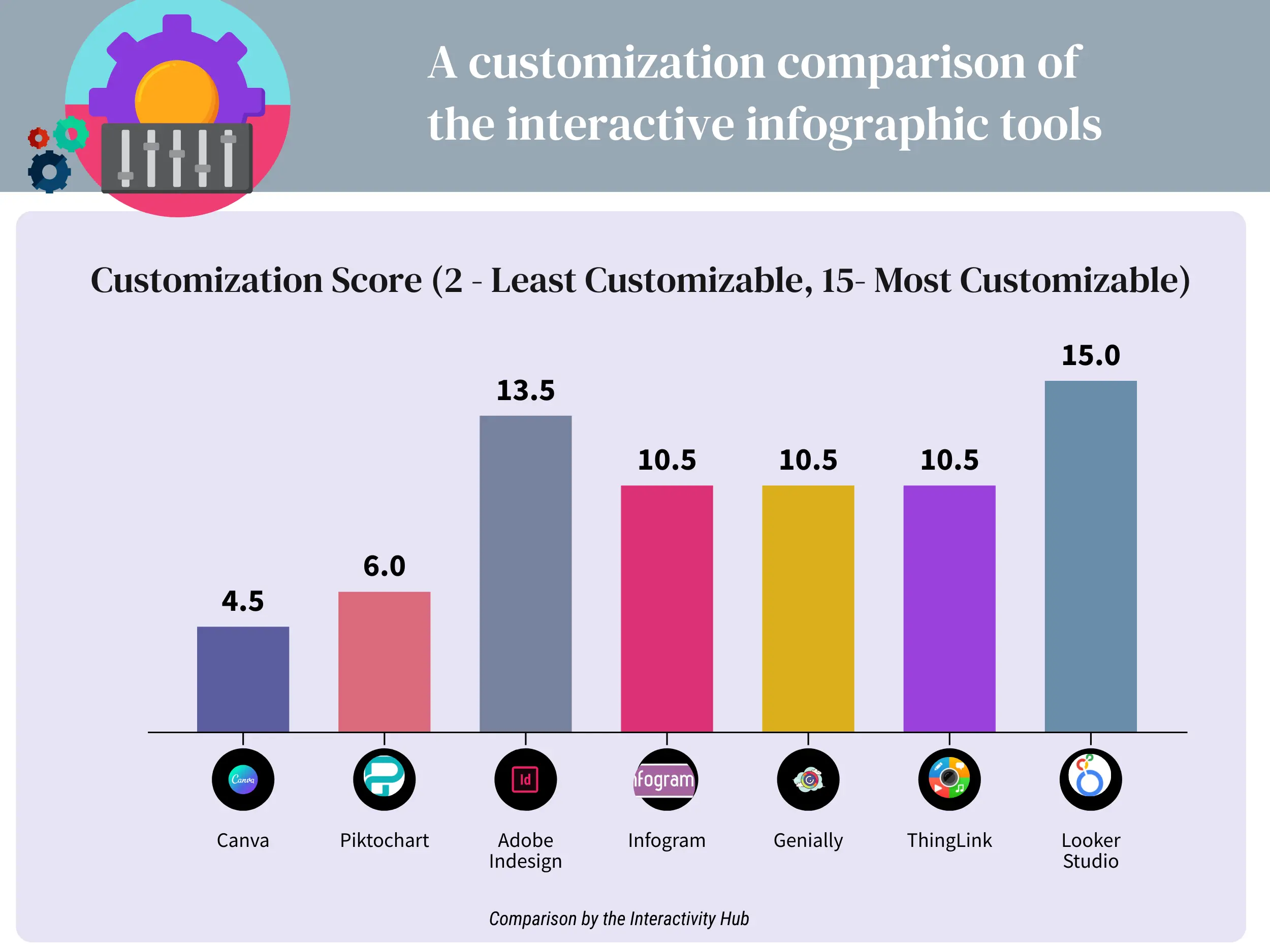
- Canva and Piktochart have reasonably good customization for basic colors, fonts and layouts within their templates.
- Genially, Infogram and ThingLink allow users more control over things like interactivity, multimedia additions and formatting.
- InDesign as a desktop publishing tool provides an extremely high degree of layout and design customization.
- Looker Studio as an advanced data visualization tool earns the top score of 10 since it empoweres users to fully customize every aspect of charts, dashboards and reports.
Customization options have been given a relatively heavier weight than ease-of-use because, unlike static infographics, when creating interactive infographics, it is very important to choose a tool with more interactive or customization features.
3. Pricing Plans
When looking at the various tools, one should ask themselves a few questions like:
- Is there a free tier where the tool can be sufficiently tested before the need to upgrade?
- Is the free tier a time-bound trial, for example a 14 day trial, or is it a “forever free” plan with limited features?
- Are the paid plans within your budget?
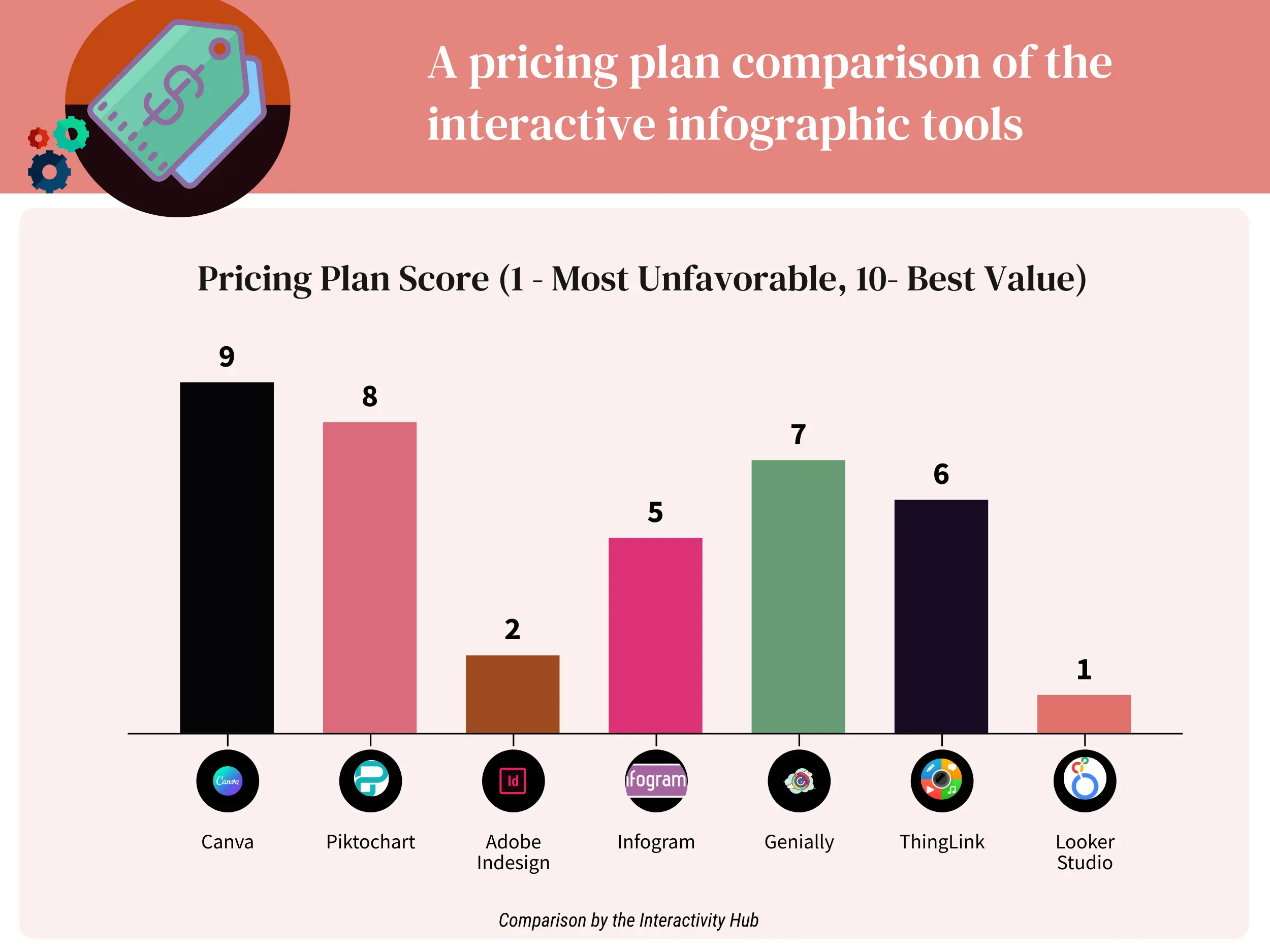
- Canva has an excellent free tier and very affordable paid plans, earning it the top score of 9.
- Piktochart also has a generous free plan and low-cost premium upgrades that provide good value.
- Genially’s free features are sufficient for many educators and plans are reasonably priced.
- ThingLink and Infogram strike a decent balance between functionality and cost.
- While powerful, Adobe InDesign’s monthly subscription is steep for individual use in a classroom setting.
- Looker Studio’s tailored enterprise pricing model is not practical for most educators’ budgets, earning it a score of 1.
4. Overall Comparison
When we put all the above scores together, we get the table below.
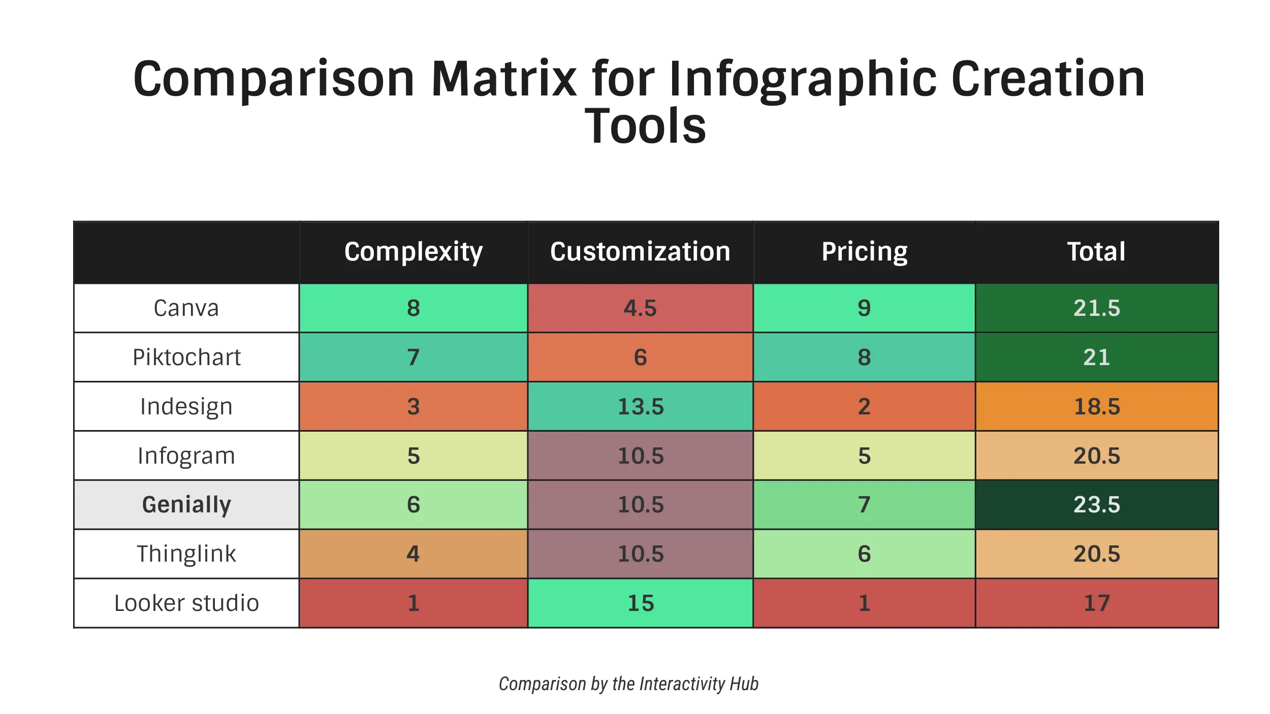
Genially is the clear winner here. It is not too hard to use or learn, it has a good number of customization as well as interactive options and it’s fairly priced for most educators.
Conclusion
Interactive infographics are a powerful tool for educators who are looking to engage their students with visual learning tools. With platforms like Genially, ThingLink, and Looker Studio, it’s easier than ever to create interactive infographics that are tailored to your specific needs.
Whether you’re looking to create game-based content, virtual escape rooms, or drag-and-drop puzzles, these platforms provide a range of features that make it easy to create engaging and dynamic infographics. And with their affordable pricing and free plans, they’re accessible to educators at all levels.
By using interactive infographics in your teaching, you can create a more engaging and memorable learning experience for your students. So, give it a try and see how it can transform your teaching!


